Understanding letterforms and flow
by Julia A. Henzerling
Fundamentals of Graphic Design
Letterforms & Typography class
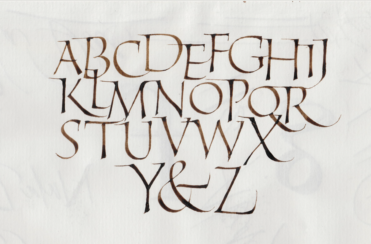
A progression of study for the graphic design student begins with the physical experience of drawing letterforms. The meditative quality of this practice produces a fluidity in movement that imbues the drawn marks with a life of their own. Flow is what we call this state: where the movement and the mind are in harmony.
“You’re not thinking about the past or the future, you’re entirely focused on the present moment. The pressure of the brush, the flow of the ink, the subtle shifts in your posture — everything becomes part of a single, unified experience.”
Ayesha Calligraphy
Word and image: semiotics
Graphic design is the visual communication that results from the dynamics of word and image on a page. We call this dynamic semiotics (the study of signs and symbols and their use or interpretation). Semiotics reveal the visual meaning of the interplay of words and images by their cognitive, social, and cultural associations.
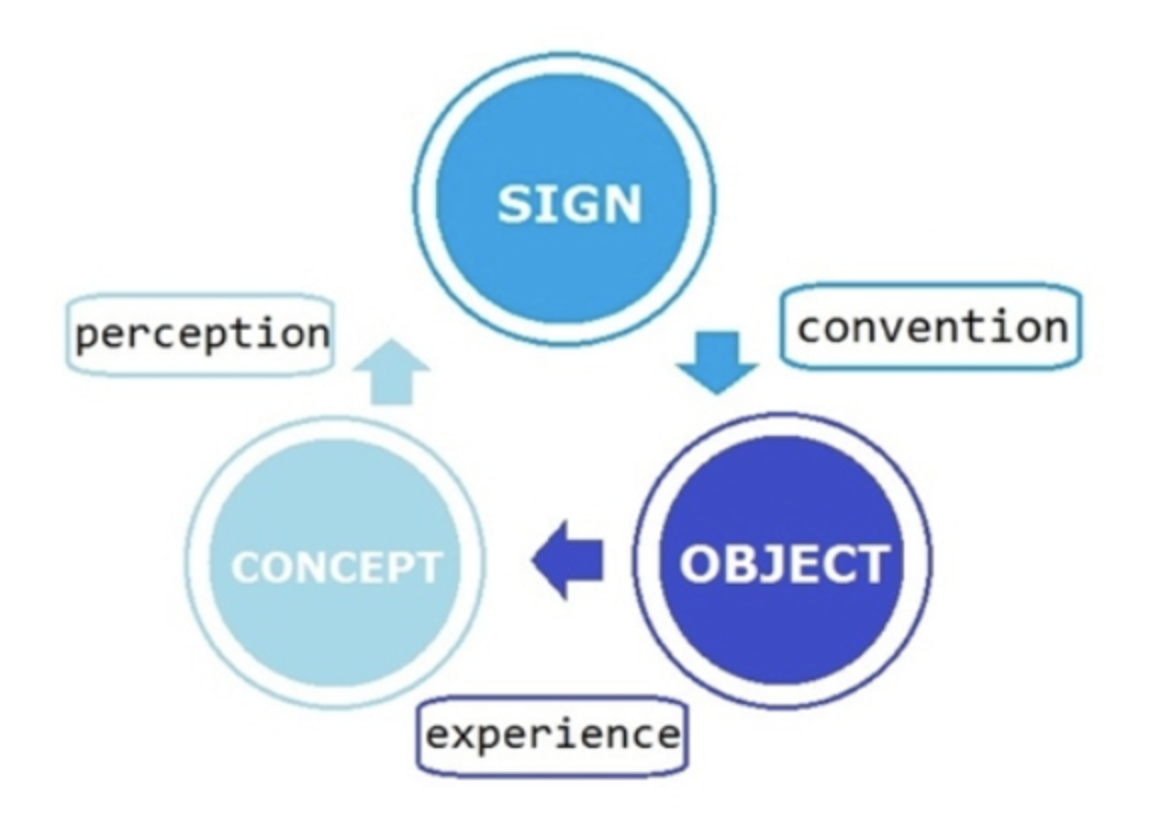
The word part of this dynamic duo carries the primary weight of visual communication. The visual form or forms respond to the words—and sometimes the words themselves are the visual form. Therefore, the graphic designer must know how to play with both the visual aspects of letterforms and the implied meanings of words—along with images that interact with them.


In this British advert campaign, Samuel Jackson is shown against a stark white background, emphasizing his formidable presence…he is such a cultural icon that most people don’t even need to hear his unique, commanding voice to understand that he is communicating “Don’t mess with me.” Juxtaposed with the play on words, this piece appeals to the reader’s humor and intelligence, letting the conclusion—a package of toasties—sell itself.
To grapple with all the semiotic power of the word and image, the graphic designer needs to know the basic principles of design: scale, color, contrast, alignment, and proximity. A study of these dynamics can be done with simple shapes first, in order to get some experience communicating concepts simply.
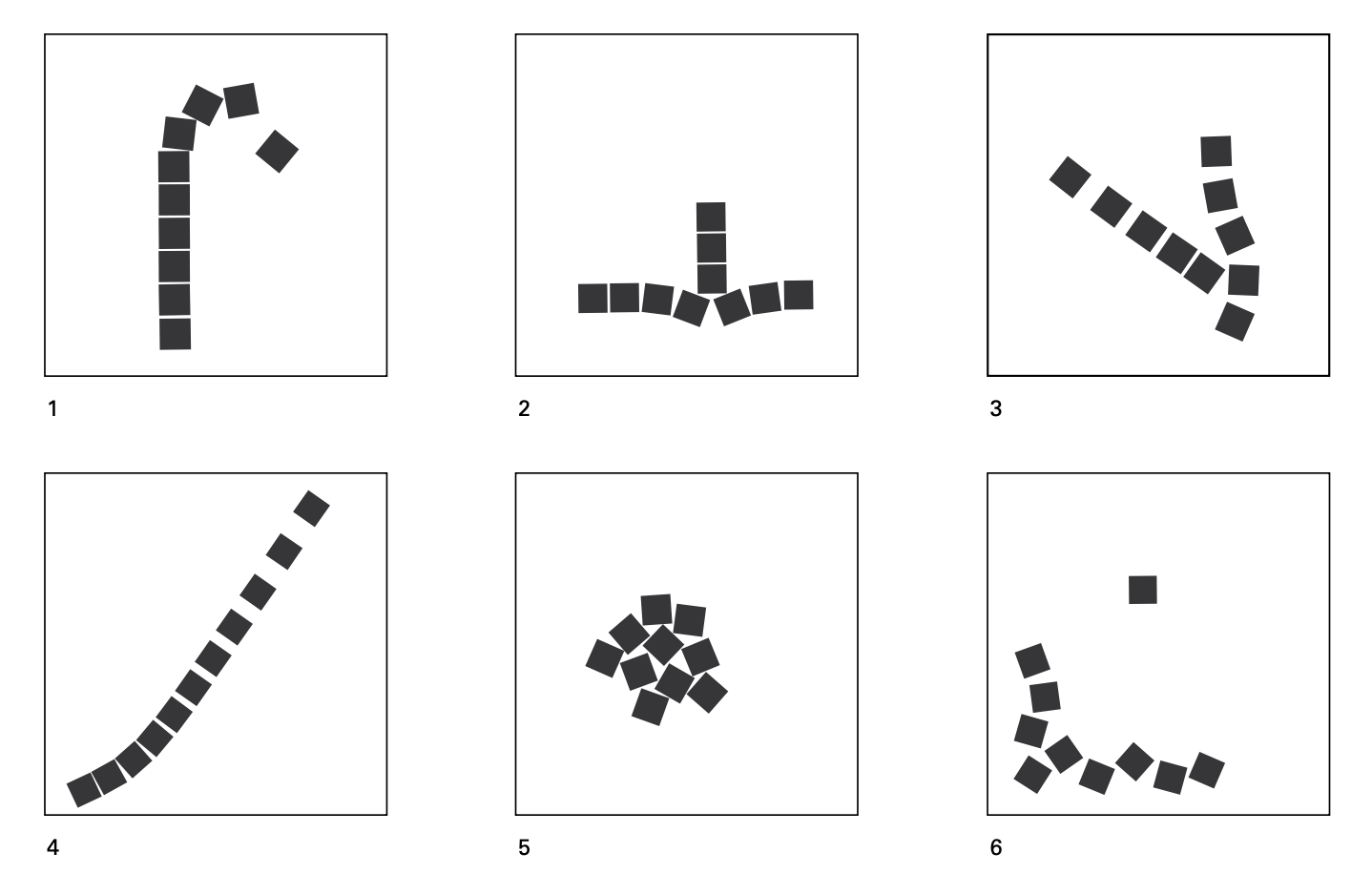
Tumble (1), pressure (2), conflict (3) flight (4), fear (5–6)
Rob Roy Kelly
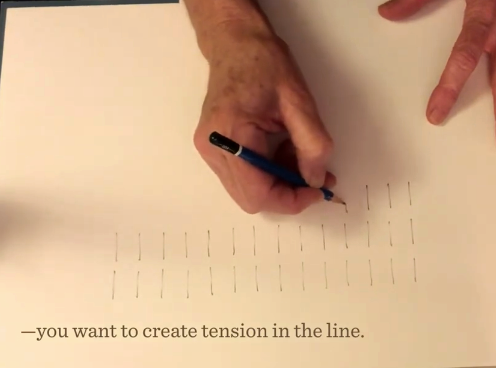
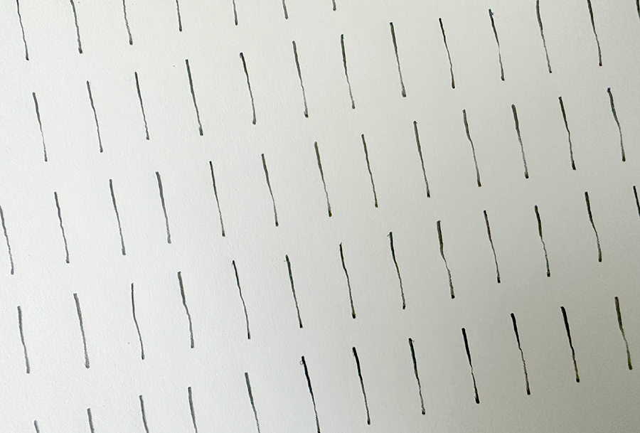
Manipulating with the written word requires designers to understand the letterforms themselves that make up these words. This is the first step in the graphic design student’s journey—and the pencil strokes exercise is the first stop on the journey. This work provides a physical understanding of all aspects of letterforms and their setting on the page. Through the physical work and the mindset it requires, the designer begins to understand flow.
Hand lettering & flow
Calligraphy is the act of making letterforms by hand. In the Western world, this is done with a pen with a flat tip dipped in ink. In China and the Middle East, it is done with a brush.
There are reasons why the monks in Medieval times worked for six hours at a time to pen illuminated manuscripts. One reason was the amount of daylight available. The other is the physical nature of the work, the slow and even pace needed to make the marks well, the position of the body, the breathing, and the concentration. Hand lettering is a moving meditation. When all these components are engaged, there is a flow to the lines and a life to the work that is palpable.
It’s not hard to understand the inherent spiritual nature of this work, when that flow is accessed. That flow can be seen in the confidence and harmony of the lines that are pulled by hand to form letters. To create the Book of Kells, 12 or so scribes worked six hours a day, for 75 years!

All calligraphers must work with a flow of energy if their work is to be “alive”—which is not the same as being formally perfect. This is most overt among Chinese calligraphers who consciously work with energy flows in the body. The use of a brush instead of a pen produces beautiful, fluid forms that are imbued with the subtle and unique characteristics of the individual.
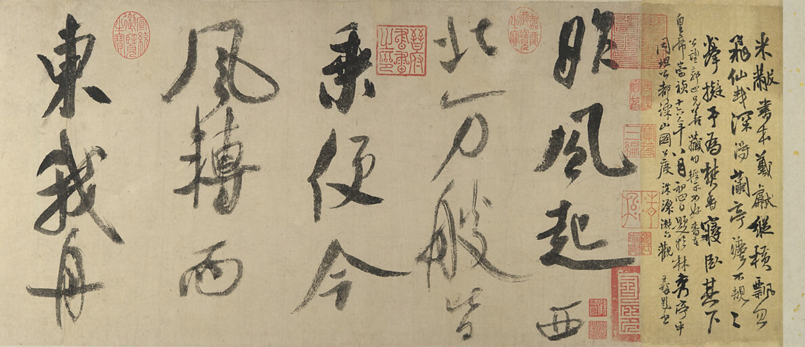
“Chinese calligraphy is not about showing something to others; instead, it is a quiet return to the self, writing for one’s own sake, immersing oneself in the flow of brushstrokes, slowing down thoughts, and focusing on the present.”
Jerrine Tan
It’s not about drawing lines but making strokes—it’s a whole body practice. Confidence, bravery, and even sensuality (the word stroke means to caresse, to soothe)—can be seen in the stroke.
We will learn physically how to pull the vertical lines first, establishing consistent spacing between strokes and placement on the page—we use no guidelines. Through the practice of drawing lines slowly and evenly, making our pencil strokes with a “pressure-release-pressure” method, we will develop a unique and uniform texture on the page. From vertical lines we move to half-horizontal, diagonal, and half circle lines. After significant practice in these basic typographic strokes, we will form Roman capital letterforms on the page.
