HENZERLINGTAOS
VISUAL COMMUNICATION
Monotype Corporation
Assignment: play with letterforms
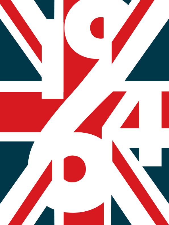
“British Invasion” composition, showcasing the use of the Metro Nova typeface
The desgin team at Monotype asked me to help promote the new typeface Metro Nova, designed by Toshi Omagari. Metro Nova is a re-intrepretation of the fontMetro, drawn and cut in 1929 by none other than the artist who coined the term “graphic design”: William Addison Dwiggins.
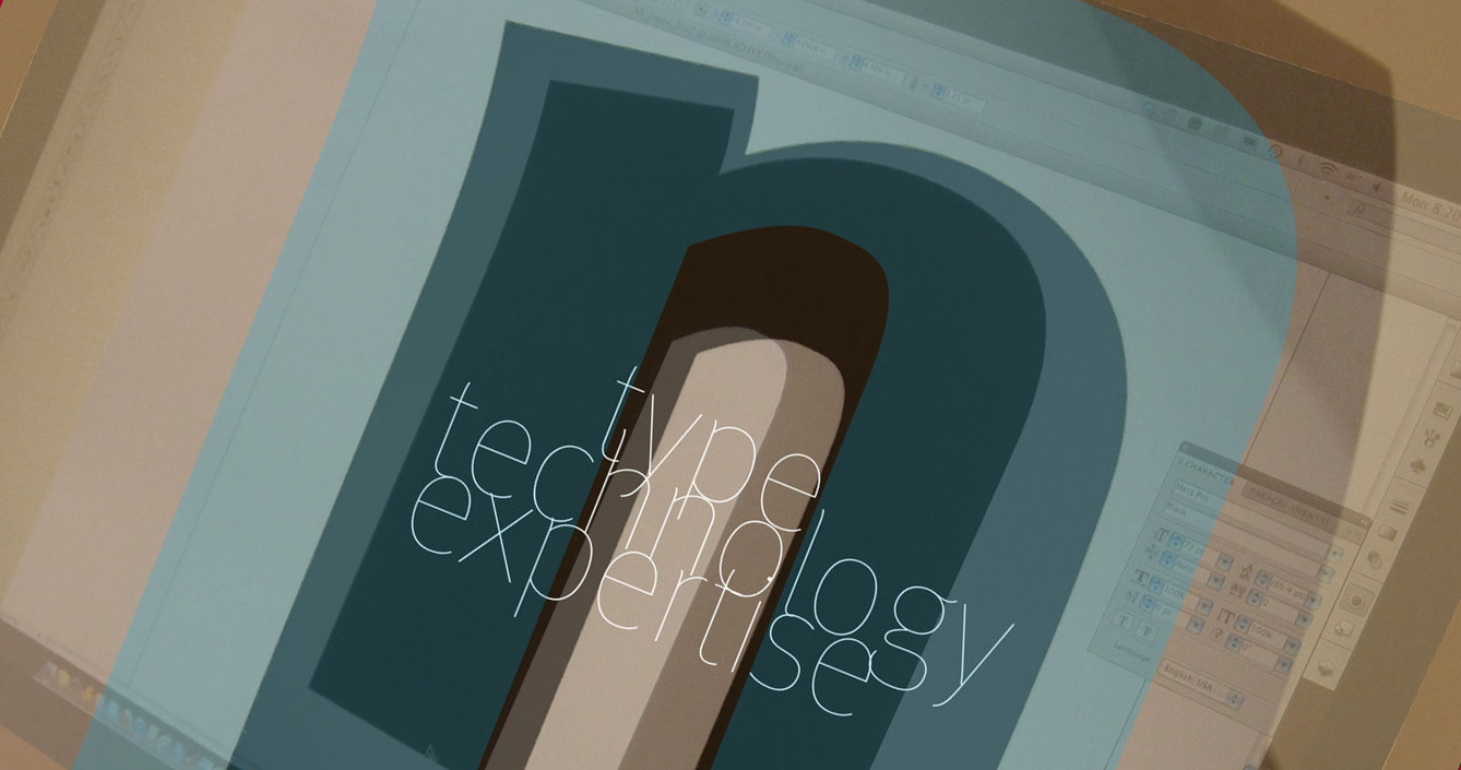
The opportunity to play with these letterforms was truly a designer’s dream. For weeks, I made countless compositions and fictional products to illustrate uses of the font.
Monotype encouraged me to continue designing type usage compositions with other font families. This was simple, pure, uncluttered fun.
Also showcasing the Metro Nova typeface, this set of layouts is inspired by the 1926 graphic design work Abeceda, by Karl Teige, Viteslav Nezval, and with the dancer Milca Mayerova in Prague. The photographs are from Taos’s own Zoe Zimmerman, and the yogi is Genevieve Robinson Oswald.
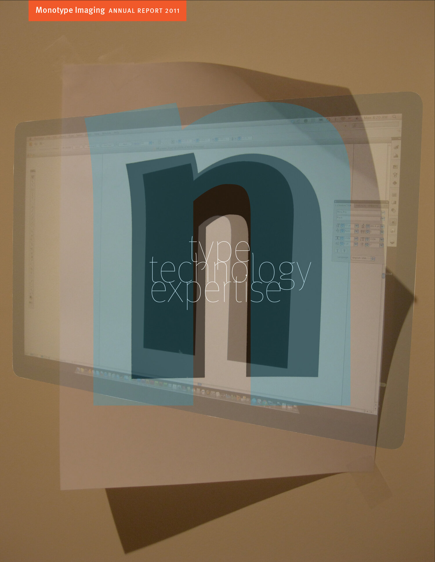
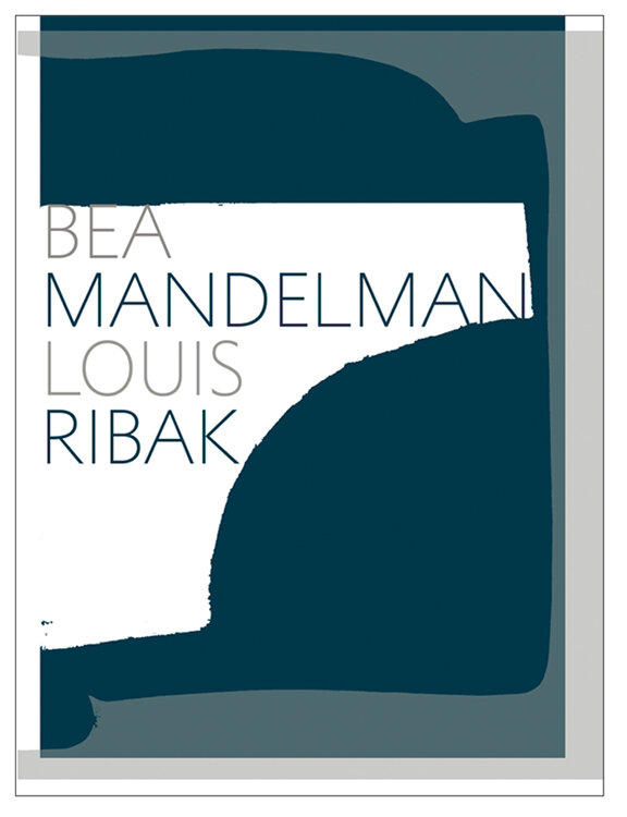
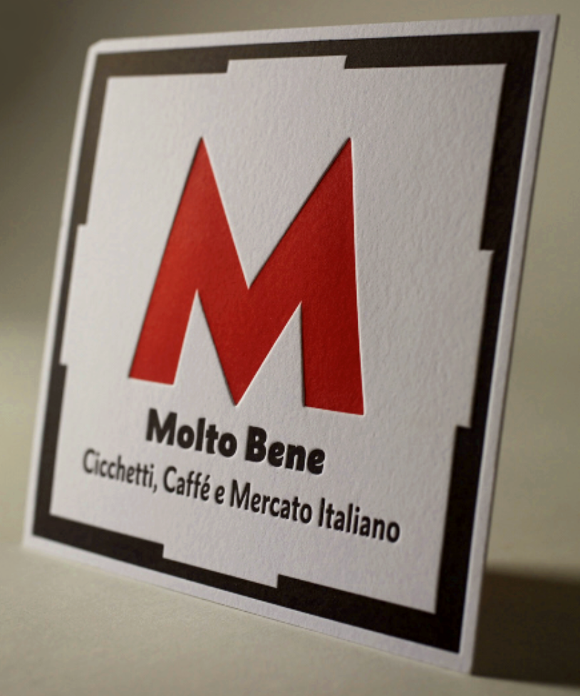
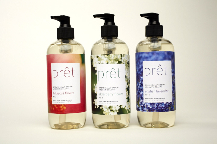
Above, a fictional annual report cover; below, gallery invitation, fictional restaurant coaster, bath soap packaging, and book cover, showcasing use of the Metro Nova typeface.
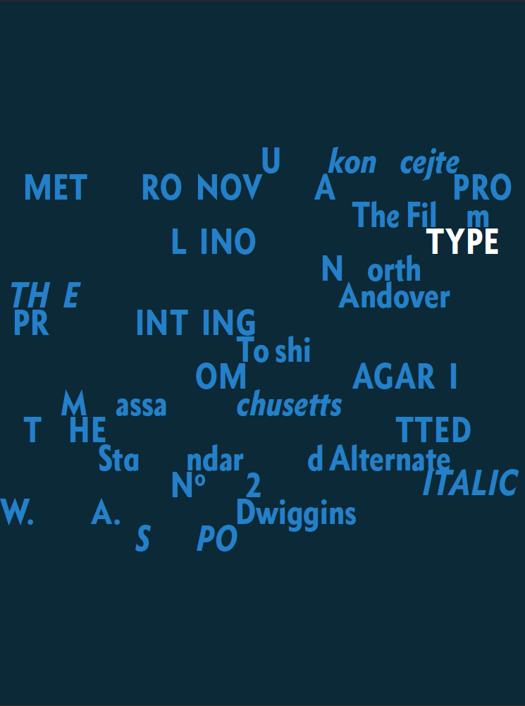
Banner compositions showcasing various Monotype font families:
Please contact me for you next project.
Let us go forth and create great content.
juliahenzerling@gmail.com
